Power Apps
Building Power Apps Generative Pages with Claude Code
A hands-on guide to building production-ready model-driven app pages using React, TypeScript, and Fluent UI V9 - powered by AI code generation and the PAC CLI.
Model-driven apps in Power Apps have long been praised for their rapid development story: define tables, configure forms, and a working application materializes. But that convenience came with a ceiling. When business requirements demanded a bespoke dashboard, a non-standard layout, or pixel-perfect UX, makers often hit the limits of the declarative surface.
Generative pages change the equation. Introduced as a preview feature in early 2026, generative pages allow developers to write full React + TypeScript components that render natively inside a model-driven app shell. The component runs in a sandboxed iframe, has typed access to Dataverse through a provided Data API, and ships with Fluent UI V9: the same design system that powers Microsoft 365. Combined with an AI-powered code generation workflow through the model-apps plugin, the entire cycle from idea to deployed page shrinks from days to minutes.
This guide walks through the end-to-end process of building a Project Tracker Dashboard as a generative page, covering schema discovery, component authoring, deployment, and verification.
Prerequisites
Before starting, ensure the following are installed and configured:
- Node.js 18+ (LTS recommended)
- PAC CLI at the latest version (
pac install latestor via the VS Code Power Platform Tools extension) - Claude Code with the model-apps plugin installed
- A Dataverse environment with at least one custom table (this guide uses a
Projecttable with columns likeName,Status,Budget,Progress, andOwner) - A model-driven app already created in the target environment
The PAC CLI must be authenticated against the target environment before starting:
pac auth create --environment https://yourorg.crm.dynamics.com
Replace the URL with the actual organization endpoint. Run pac org who to confirm the connection.
Step 1: Setup and Plugin Configuration
With the PAC CLI authenticated, the model-apps plugin handles the integration between the AI code generation workflow and the Dataverse environment. Once installed, it exposes commands for schema generation, code scaffolding, and one-command deployment.
The plugin automatically detects the active PAC CLI auth profile and the selected environment. Developers can verify readiness by listing available model-driven apps:
pac model list
This returns the app IDs needed later for deployment. Note the App ID of the target model-driven app: it will be required during the upload step.
Step 2: Generate the Schema (The Most Critical Step)
Dataverse column names are notoriously unintuitive. A column labeled "Project Name" in the UI might be cr4a2_name or pblab_projectname at the API level, depending on the publisher prefix and the exact moment it was created. Guessing column names, or letting any tool hallucinate them, is the single fastest path to a broken page.
The generate-types command solves this by querying the Dataverse metadata API and producing a TypeScript file with every column name, type, and relationship for the specified tables:
pac model genpage generate-types \
  --data-sources "pblab_project,pblab_task,pblab_deliverable" \
  --output-file RuntimeTypes.ts
This produces a RuntimeTypes.ts file containing typed interfaces for each table. The file includes the exact logical names, option set values, and relationship navigation properties. Every column reference in the page component should come from this file, never from memory or documentation alone.
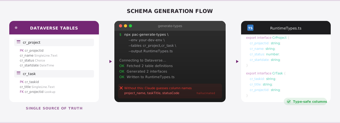
Open the generated file and review the column names. Confirm they match what appears in the Dataverse table designer. This five-minute verification step prevents hours of debugging later.
Step 3: Write the Page Component
A generative page is a single TypeScript file that exports a React component. The framework injects props containing the Data API, navigation helpers, and formatting utilities. Here is the skeleton every page starts from:
import React, { useState, useEffect } from "react";
import {
  makeStyles,
  tokens,
  Card,
  Text,
  Badge,
  ProgressBar,
  Spinner,
  Input,
} from "@fluentui/react-components";
import { SearchRegular } from "@fluentui/react-icons";
import type { GeneratedComponentProps } from "./RuntimeTypes";
Note the imports: React 17 (not 18: the generative pages runtime ships React 17), Fluent UI V9 components, and the generated types. The GeneratedComponentProps type provides full IntelliSense for the Data API.
Querying Dataverse
The Data API exposes a queryTable method that mirrors OData query syntax:
const ProjectDashboard: React.FC<GeneratedComponentProps> = ({ dataApi }) => {
  const [projects, setProjects] = useState<any[]>([]);
  const [loading, setLoading] = useState(true);

  useEffect(() => {
    const loadProjects = async () => {
      try {
        const result = await dataApi.queryTable("pblab_project", {
          select: [
            "pblab_name",
            "pblab_status",
            "pblab_budget",
            "pblab_progress",
            "pblab_startdate",
            "pblab_enddate",
          ],
          filter: "statecode eq 0",
          orderBy: "pblab_name asc",
          pageSize: 50,
        });
        setProjects(result.rows);
      } catch (err) {
        console.error("Failed to load projects:", err);
      } finally {
        setLoading(false);
      }
    };
    loadProjects();
  }, [dataApi]);

  // render logic follows
};
Every column name in the select array comes directly from RuntimeTypes.ts. The filter uses standard OData syntax. The orderBy accepts a string with the column name and direction.
Accessing Formatted Values
Dataverse returns raw values by default: option sets come back as integers, dates as ISO strings, and currency as plain numbers. For display-friendly values, use the OData formatted value annotation:
const statusLabel =
  row["pblab_status@OData.Community.Display.V1.FormattedValue"] ?? "Unknown";
const budgetFormatted =
  row["pblab_budget@OData.Community.Display.V1.FormattedValue"] ?? "$0";
This pattern retrieves the localized, human-readable label that Dataverse computes server-side. It respects the user's language settings and currency format. Always prefer formatted values for any column that is an option set, currency, date, or lookup.
Styling with Fluent UI Tokens
Generative pages run inside a Fluent UI V9 provider, so makeStyles and design tokens work out of the box:
const useStyles = makeStyles({
  container: {
    display: "grid",
    gridTemplateColumns: "repeat(auto-fill, minmax(320px, 1fr))",
    gap: tokens.spacingHorizontalL,
    padding: tokens.spacingHorizontalXL,
  },
  card: {
    padding: tokens.spacingHorizontalL,
    borderRadius: tokens.borderRadiusLarge,
    backgroundColor: tokens.colorNeutralBackground1,
    boxShadow: tokens.shadow4,
    transition: "box-shadow 0.2s ease",
    ":hover": {
      boxShadow: tokens.shadow8,
    },
  },
  statValue: {
    fontSize: tokens.fontSizeHero900,
    fontWeight: tokens.fontWeightSemibold,
    color: tokens.colorBrandForeground1,
  },
  progressSection: {
    display: "flex",
    flexDirection: "column",
    gap: tokens.spacingVerticalS,
  },
});
Using tokens rather than hard-coded values ensures the page adapts to theme changes (dark mode, high contrast) automatically. This is not optional polish: it is a requirement for any page that ships inside a model-driven app, since administrators can apply custom themes at the environment level.
Putting It Together
A complete Project Tracker Dashboard might include summary statistics at the top (total projects, total budget, average progress), a search/filter bar, and a card grid showing each project with its status badge, budget, date range, and progress bar:
return (
  <div className={styles.container}>
    {/* Summary stats row */}
    <Card className={styles.card}>
      <Text className={styles.statValue}>{projects.length}</Text>
      <Text>Total Projects</Text>
    </Card>

    {/* Project cards */}
    {filteredProjects.map((project) => (
      <Card key={project.pblab_projectid} className={styles.card}>
        <Text weight="semibold" size={500}>
          {project.pblab_name}
        </Text>
        <Badge appearance="filled" color={getStatusColor(project.pblab_status)}>
          {project["pblab_status@OData.Community.Display.V1.FormattedValue"]}
        </Badge>
        <div className={styles.progressSection}>
          <Text size={200}>Progress</Text>
          <ProgressBar
            value={project.pblab_progress / 100}
            thickness="large"
            color="brand"
          />
          <Text size={200}>{project.pblab_progress}%</Text>
        </div>
      </Card>
    ))}
  </div>
);
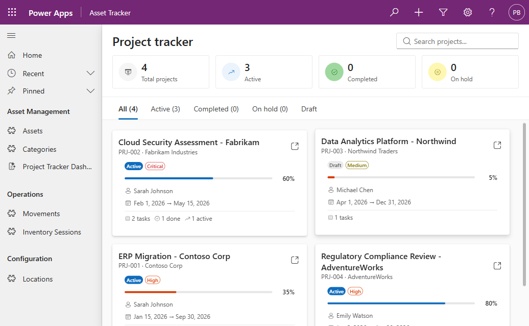
The result is a fully interactive dashboard that inherits the model-driven app chrome, navigation, sitemap, header, and theme, while rendering a completely custom React surface inside the content area.
Step 4: Deploy with a Single Command
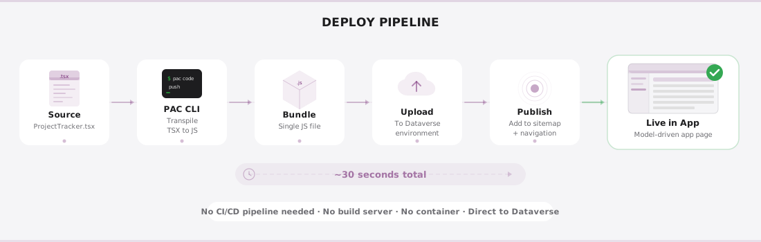
Deployment is where generative pages truly shine compared to traditional PCF controls or embedded canvas apps. A single PAC CLI command handles transpilation, bundling, publishing, and sitemap registration:
pac model genpage upload \
  --app-id 00000000-0000-0000-0000-000000000000 \
  --code-file ./project-tracker-dashboard.tsx \
  --data-sources "pblab_project,pblab_task,pblab_deliverable" \
  --add-to-sitemap
Replace the --app-id with the actual model-driven app GUID. The --data-sources flag must list every table the component queries: this sets up the security trimming so the page only loads for users who have read access to those tables.
The --add-to-sitemap flag automatically creates a sitemap entry so the page appears in the app navigation. Without it, the page is uploaded but not visible until manually added through the app designer.
The upload command typically completes in under 30 seconds. Behind the scenes, the PAC CLI transpiles the TypeScript, bundles it with the React and Fluent UI runtime, uploads the package to the environment, publishes all customizations, and updates the sitemap XML.
Step 5: Verify in the Browser
Open the model-driven app in a browser. The new page should appear in the left navigation. Click it and verify:
- Data loads correctly: the cards should populate with live Dataverse records
- Formatted values display properly: status badges should show labels (not integer codes), budgets should show currency formatting
- Search and filter work: if implemented, test the interactive elements
- Theme compliance: switch to dark mode in the Power Apps settings and confirm the page adapts
If columns show undefined or blank values, the most common cause is a mismatch between the column names in the code and the actual Dataverse logical names. Return to RuntimeTypes.ts and verify every column reference.
Key Takeaways
- Schema-first development prevents errors. The
generate-typescommand eliminates guesswork around Dataverse column names. Run it before writing any component code, and re-run it whenever the table schema changes. - Single-file architecture keeps things simple. A generative page is one TSX file. There is no project scaffolding, no webpack configuration, no package.json to maintain. The PAC CLI handles the build pipeline.
- Fluent UI V9 tokens ensure theme compliance. Hard-coded colors and spacing will break under theme changes. Tokens adapt automatically.
- Formatted values are non-negotiable for display. Raw Dataverse values (integers for option sets, ISO dates, unformatted currency) are unsuitable for end users. Always use the
@OData.Community.Display.V1.FormattedValueannotation. - One-command deployment removes friction. The upload command handles transpilation, bundling, publishing, and sitemap in a single step. Iterate fast.
What Comes Next
Generative pages are currently in public preview as of March 2026. The feature is expected to reach general availability later in 2026, with additional capabilities including multi-file components, shared libraries, and deeper integration with model-driven app forms.
For the latest documentation, visit the official Microsoft Learn page: Create generative pages for model-driven apps.
Developers exploring this feature should keep a close eye on PAC CLI release notes: the model genpage command group is evolving rapidly, and new flags and capabilities are being added with each release.
The combination of a code-first approach, typed schema generation, and single-command deployment makes generative pages one of the most significant additions to the Power Apps developer experience in years. For teams already comfortable with React and TypeScript, the barrier to building rich, custom experiences inside model-driven apps has never been lower.